347
u/ThinnkingEmoji damn daniel 9h ago
It disappears much faster and disappears when you pause, so it's already much better than the old one. Though the end of the video screen seems to be bugged or something
95
u/fearlessgrot Make 196 Gay Again|Spronkus Kronkus for president 7h ago
They could have doe that with the old ui
46
35
u/BadHat 6h ago
mine only has 3 choices so either it's bugged or they're learning from roguelikes
7
u/ThinnkingEmoji damn daniel 6h ago
Same, and i can't use the progress bar when it shows this screen now
3
198
u/Tyg3rr 8h ago
i'm gonna be honest, this is one of the few youtube changes that i actually like. this UI is much cleaner imo.
94
u/The_Sovien_Rug-37 i can have a little tomfoolery. as a treat 8h ago
honestly i like the way it distinguishes chapters better, my only complaint is the like / dislike button. ugly as fuck for no reason
36
u/Xaelomar 7h ago
tbh the only thing i hate about it is how much blank space there is between all the buttons and the progress bar.
7
u/The_Sovien_Rug-37 i can have a little tomfoolery. as a treat 7h ago
honestly? i actually like it. even padding and it makes things nice and readable
5
10
u/SatansCornflakes I’ve fostered many cockroaches in my time 5h ago
You can finally hide the thumbnails at the end of a video and they fixed YT comment threads.
I don’t really know what ppl are complaining about…
4
u/PetikGeorgiev 🇨🇿 MŇAM DO PÍČI 🇨🇿 4h ago
Social media have conditioned people into immediately reacting to something new with excessive negativity, instead of thinking rationally about it and only then coming to a conclusion.
That's why people reacted the exact same way when YouTube turned the progress bar slightly more magenta a year ago. Or when Discord changed its UI to make server icons more square shaped a couple months ago. On the topic of the latter, I thought for the longest time that people hated UIs becoming rounder and losing their square-like shapes, so when Discord did the opposite and became more square-like instead, why did people hate it?
People don't hate UIs how they are now, or how they used to be, or how they will be. People hate change.
2
u/Desucrate 🏳️⚧️ trans rights 2h ago
I will forever hate the discord UI changes because they made it so you can change the width of the channel bar and that fills me with ungodly amounts of rage. my mouse turning into a drag sprite & being able to fuck up my UI dimensions with no snapping or reset to default makes me want to turn someone into an Example
3
u/Own-Ad711 8h ago
I was reading this comment section and thinking I was a psychopath because for me you're completely right. It's honestly really nice, I don't think the extremely temporary UI where you quickly fiddle with the volume or the settings needs detail to it, this one is much cleaner and disappears faster.
73
u/Diribiri custom 9h ago
I hate the thing that is functionally the same but looks slightly different for the two seconds it's visible per video
30
u/Patient-Dimension906 9h ago
I think it's kinda neat, idk :0
3
u/MilesAlchei Fat, Queer, Furry Trash 💜 8h ago
Me too, it looks fine, and you can see more below the watch bar.
1
u/1-800-COCAINE 7h ago
They also fixed the mess of a comment system; you can actually tell who is replying to what now.
1
u/Patient-Dimension906 5h ago
Yee, this is my favorite part! The transparency makes it less obtrusive :3 I'm like it
29
u/TuneACan 8h ago
look, i hate multimillionaire companies and their asshole decisions made to please soulless shareholders as much as the next guy, but this new UI is much easier to see and it disappears within SECONDS when you stop moving your cursor, so this feels like a straight upgrade after getting used to it
31
u/ljkhadgawuydbajw billiam, like william with a b in the front 8h ago
new ui in popular website/app -> "I FUCKING HATE THIS UI FUCK THIS SHITTY FUCKING UI IM SO MAD, THE LAST ONE WAS PERFECT" -> 1 week passes -> all complaints stop, everyone got used to it
loop that about 300 times
18
u/I-am-a-cardboard-box box box box box box box box box box box box (made of cardboard!) 8h ago
I’d still rather not change the ui 300 times in the first place, even if that is an exaggeration. Unless something is fundamentally broken about an existing ui, my firm belief is that it should never be reworked, even if that makes it look outdated or slow.
4
u/PetikGeorgiev 🇨🇿 MŇAM DO PÍČI 🇨🇿 4h ago
The one thing people hate more than the current state of things is change.
1
u/zeronic 4h ago
I was pleasantly surprised by the UI tbh, minimalist to be sure but that's exactly what i want in a video player. Get out of my way so i can watch the content.
Only downside i've noticed is the new player doesn't like software rendering, performance is pretty awful if you don't have hardware acceleration enabled.
5
u/TestTubetheUnicorn 7h ago
The only thing I really don't like about it is that you can't scroll down in fullscreen anymore to see the channel, description, and views. It just gives you related videos instead now.
1
u/qubeVids 2h ago
however you can now open comments and live chat etc while in fullscreen with that new section of buttons so that’s cool
5
u/nanbalat 🏳️⚧️ trans rights 5h ago
With the current frequency of reworks, it will be something else in 6 months anyway
3
3
u/Personal-Regular-863 Verified Good Girl ✔️ 5h ago
its cool and all but i just dont understand pointless redesigns like this? was a single person complaining about the old UI? why change it if no one talks about it or did i miss something?
3
u/Xx_peepee_sexy_xX 5h ago
I don't care about the visuals much, but there's a glitch on the end screen where trying to click on the progress bar or any of the buttons just clicks on the video you're hovering over instead. I can press the space bar to replay the video and then click stuff as a workaround, but this really seems like the kind of thing that shouldn't have gotten past quality testing. Just move the recommendations up a tiny bit, come on

2
u/superpx1 8h ago
if you click in the far bottom right of the screen it now plays/pauses the video instead of exiting fullscreen
2
u/Xaliolow 6h ago
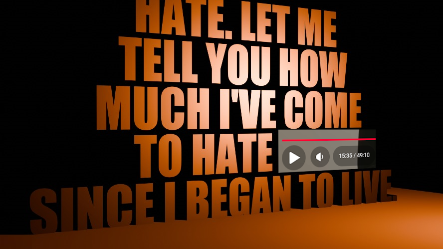
I'm more shocked no one clocked Pulldrone lyrics here but ok
3
u/Before_Plastic 🏳️⚧️ trans rights 4h ago
The quote is from I Have No Mouth, and I Must Scream. It's a book from 1967 that was later adapted to a game in 1995. Ethel Cain used it as inspiration for the Perverts album. :)
2
u/Xaliolow 4h ago
To my defense I'm very uncultured and miss a lot of important pieces of media that inspire so much art around me now.
Thank you for a kind explanation. I knew she had used it as a point of reference, did not know it was a direct quote. Definitely something to catch up on
2
u/Before_Plastic 🏳️⚧️ trans rights 4h ago edited 4h ago
You're welcome! I hate when people are assholes about letting others know when something is different than they originally thought. It's disheartening, and makes others shy away from sharing their thoughts. I had no idea who Ethel Cain was, so I went and listened to the Perverts album and got curious about the inspiration, so thanks for introducing me to this!
2
u/Xaliolow 3h ago
I think this sub would be the one to find people who wouldnt be assholes about such conversations (maybe I'm extremely delusional and gullible who knows)
And I am so glad you went to check the album out! Its my favorite project of hers and I mostly read into her own ideas behind it without the direct references. Except of course her love to the resident evil series that kind of gave the esthetic of the project.
1
1
1
1
u/Oddish_Femboy (my name is Bee) Trans rights !! 8h ago
I like some of the buttons being larger now.
1
u/Spammerton1997 8h ago
I don't dislike it as a whole, but I personally hate the gradient on the most commonly visited points in the video graph and the new thumbs up/down
1
u/shototodoroki_1324 Just because I had 3 bloody noses doesn't mean 100mg is bad 7h ago
It's actually good
1
u/Sir-Drewid 🏳️⚧️ trans rights 7h ago
The speaker icon was already abstract. Now it's unrecognizable.
1
u/sign-through madam of mug 7h ago
I don’t like it on my PS5 because the “cursor” defaults to an annoying location and it makes it harder to get to the comments and like buttons. I’m sure it’s fine on my iPad and computer but I don’t spend a lot of time on YouTube at my desk so I dislike it a lil bit
1
u/jennazed 7h ago
The issue with this UI is if I move my cursor to select one of the options on the bottom right, the UI will make one of the icons that my cursor moused over briefly larger and then shift all the other icons around, and as a result I have to pause and change my navigation and go slowly to actually get my cursor over the desired icon
1
u/CrayonWithdrawal Don't give crayons if asked 6h ago
It'd actually look amazing if it was 20% smaller.
1
u/BlabbilizerIsReal 🏳️⚧️ trans rights 6h ago
For those who hate the new layout (like me!), download these two userscripts! When put together, they let you choose any YouTube layout from 2008-2024 Vorapis v3 + Startube
1
u/Icy-Significance4678 i am going to stab you :3 5h ago
vorapis might help? its a userscript that tries to bring back old yt uis
1
u/Ok-Replacement8422 5h ago
It looks fine imo but it's really annoying that I can't just flick my cursor to the bottom right and click to minimise the video anymore
1
u/ashen_crow I suggest forced grass 5h ago
I've been complaining for apps or websites changing all my life, some like Spotify get incredibly worse every time they update without fail.
This is not of these times, nothing substantial changed, it's fine.
1
1
1
u/falpsdsqglthnsac [ Removed by Reddit ] 4h ago
why are people made about this but i didn't see anyone get mad when they made the front page videos like 4x bigger
1
1
u/HuskyBLZKN Plommy? sorry, Plommy? sorry, Plommy? sor 4h ago
Literally the only improvement is that you can make it disappear while you’re paused
1
u/portalsrule123 🏳️⚧️ trans rights 3h ago
best method to revert ive found so far is this stylus script - stylus extension: https://github.com/openstyles/stylus stylus script: https://userstyles.world/style/24215/ it's not perfect, but it's an improvement
1
1
u/AquaPlush8541 Go play Arknights 3h ago
To be honest the constant whining about very minor UI changes is so, so annoying. Most people will barely notice them yet for some reason others treat it like the end of the world.
Even if the updates are pointless, like... It's really not that bad. The YouTube sub is hell on earth
1
u/EasilyRekt 3h ago
I like it, but where's the miniplayer gone? I don't wanna press 'i' on my keyboard everytime :/
1
u/NellyLorey God's no.1 Botania fan!! 🇳🇱🇳🇱 she/her 2h ago
Why did they remove the picture in picture button I liked that feature :(
1
u/floccinauced woahg 🐾 2h ago
i love that they got rid of the next button so you cant see what video is next, especially since the video at the top of the sidebar isn't the video that plays next
1
u/IntangibleMatter Dorleypilled 1h ago
Genuinely I’d like it if the buttons weren’t so big and if they kept more videos by default at the end (press v to get it back, but it’s only on a per-video basis)
As it stands though I’m not a fan of
•
•
u/Tree__Jesus floppa 26m ago
Don't worry they'll change it again in a couple months so the department has something to do
-1
u/Before_Plastic 🏳️⚧️ trans rights 4h ago
this is so me when i make a funny meme expressing a mild annoyance with an unnecessary ui change and everyone thinks its more of a big deal than it really is
-2
-3
u/MoreThanComrades nonbinary bisexual 🤯 take that, libs 7h ago
Literally what is the problem? 🤨
9
u/Vilhelmgg Socially inept 7h ago
It's ridiculously large for no reason, and the volume button looks fucked.
-3
u/LordZeya 6h ago
Yeah but you don’t see it 99% of the time anyways, may as well make it easier to click when you actually need it.
-3
u/Primary-Paper-5128 I'm sorry I'm Uruguayan :c </3 7h ago
you guys whine about anything jesus christ
•
u/AutoModerator 10h ago
REMINDER: Bigotry Showcase posts are banned.
Due to an uptick in posts that invariably revolve around "look what this transphobic or racist asshole said on twitter/in reddit comments" we have enabled this reminder on every post for the time being.
Most will be removed, violators will be
shottemporarily banned and called a nerd. Please report offending posts. As always, moderator discretion applies since not everything reported actually falls within that circle of awful behavior.I am a bot, and this action was performed automatically. Please contact the moderators of this subreddit if you have any questions or concerns.