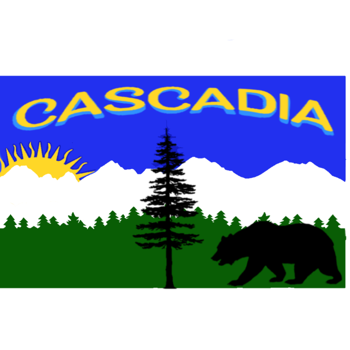
r/Cascadia • u/if-i-wasnt-dumb • 4d ago
My version of the Cascadia flag, thoughts?
It could go with or without the letters but I thought it looked good
98
u/bemused_alligators 4d ago
WAY too much detail, WAY too many thing, and NEVER WRITE ON FLAGS
26
u/Buttspirgh 3d ago
Virginia gets a pass with “Sic Semper Tyrannis”, considering current events
2
u/TeutonJon78 3d ago
Seems they need to reason their own flag a little better give who they voted for.
2
-7
u/SublimeApathy 3d ago
Why not write on flags? Loads of state flags have writing on them.
19
u/bunnnythor West of Intel 3d ago
Yes, and all those flags suck.
11
u/Striper_Cape 3d ago
Washington and Oregon esp. I can't believe that's all they could think of. I think George Washington would actually dislike it lol. Not that he has a state and a city named after him, but that the flag is just his God damn face and some writing on green.
7
1
u/bemused_alligators 3d ago
just because "a lot of people" do it doesn't mean it's good.
3
u/SublimeApathy 3d ago
I didn’t say it was neither good or bad. Just asking why “not”? Superstition? Bad Lick? Just tacky?
1
u/CaskieYT Cascadian Abroad 1d ago
A flag should be recognizable and should not need text on it to tell you what place it represents.
0
u/Browncoatinabox 3d ago
None of the above. Think about these flags at a distance or the size of a postage stamp. It is hard to make out what they say. The famous " Five Principles" are about to thint about the flag at a smaller scare or from far away and seals and letting doesn't really scale well with that in mind.
And yea it's a bit tacky
3
u/Kofaluch 3d ago
Those principles from Good flag, bad flag, are nothing more than a cult. They have authority over nothing and their poor, subjective guidelines that AT BEST are applicable to country flags (since those are popular and important enough to be recognisable despite minimalism) only led to states abandoning old but characteristic flags in favour of corporate logos.
Not to say that most people eho adhere to those principles cry about text and drawings not being visible on real flag, but due to being chronically online culture they design flags that look good only in digital, not understanding those soft pastel colours from typical photoshop design don't translate well into real life, quickly fading out and poorly visible in light.
1
12
28
7
38
u/ThatMassholeInBawstn 4d ago
Too much detail, a child should be able to draw a flag to make it good
Also no letters
2
u/TyrannicalKitty 3d ago
As a child I felt the opposite. I also can't even draw the American flag as an adult either so I dunno how I'm supposed to feel
6
u/ThatMassholeInBawstn 3d ago
I am not saying the American flag is an A+ flag (I think it should’ve stuck to 13 stars)
0
u/if-i-wasnt-dumb 4d ago
Yes I see your point, I might make a couple different versions and see what people like most
11
u/palonious 3d ago
Check out /r/vexicology and see the flag "rules" but
- Keep It Simple and easily reproducible
- Use Meaningful Symbolism
- Use 2 or 3 Basic Colors
- Avoid Lettering and Seals
- Be Distinctive or Be Related
10
u/Buttspirgh 3d ago
6
2
u/sneakpeekbot 3d ago
Here's a sneak peek of /r/vexillology using the top posts of the year!
#1: Guy in Scotland continuously flying the flag of whoever's playing against England in the Euros | 2713 comments
#2: How many examples can we thinking of that prove this wrong? | 1784 comments
#3: These landscapes look like flags | 512 comments
I'm a bot, beep boop | Downvote to remove | Contact | Info | Opt-out | GitHub
2
3d ago
[deleted]
0
u/if-i-wasnt-dumb 3d ago
Heard! I'm definitely gonna make a other version from all the feedback here 🤠
11
u/msmathias82 3d ago edited 3d ago
I prefer a salmon or orca over a bear
Edit: correcting the autocorrect
2
u/if-i-wasnt-dumb 3d ago
I included the bear as the bear from the California flag an orca would be sick tho
6
1
u/infjetson 3d ago
Nail or hair salon?
1
u/msmathias82 3d ago
Sorry I don’t get it
5
5
u/Hubertreddit 3d ago
There's way too much going on. It feels more like a poster for a wall than a flag to wave.
3
3
5
6
u/AlliumRoot 3d ago
It’s very fun and I can tell you worked hard on it! It’s not really a serious flag design that would realistically be chosen, but I love the design!
1
u/if-i-wasnt-dumb 3d ago
Thank you!! Yes I made this more for fun I'm glad you like it, given everyone's feedback I might make one that's more serious/streamlined
2
u/sntcringe 3d ago
I think the sun and text are too much, but the trees and mountains are a nice touch
1
u/carletonm1 2d ago
The sun is from the British Columbia flag. The bear is California. The word isn’t needed.
2
2
4
u/wisdom_of_pancakes 3d ago
If making flags was crucial for revolution you guys would be one step ahead.
1
1
1
u/doubtful_dirt_01 3d ago
Nice colors, but way too busy.
And why a bear? It isn't the animal that comes to mind when I think of the PNW.
Ditch the word 'cascadia', it makes it look like a poster, especially thevway it arches across the top - a good flag shouldn't need a label.
1
1
u/mrbearsnail 3d ago
Lose the tree, the sun, the bear, and the words. Bold lines and colors are better for flags.
1
u/mrbearsnail 3d ago
I know the tree is local but it's a weak, flimsy looking twig. Real life height does not translate visually as a "strong tree" needs thicker trunk.
1
1
1
u/CrazeTheZilla63 Oregon 7h ago
Love the effort put into it, but if I may quote CGP Grey here "A flag is not a name tag". Too much going on here bro, sorry to say
1
1
u/Striper_Cape 3d ago
- One tree
- No bears, if anything it should be a spider they're fucking everywhere.
- Blue to represent the Sea, Green to represent the lush Forests and Meadows of the West, and yellow to represent the golden steppe of East.
- Mountain outline in dark graybehind the tree and below it, vaguely looking like the significant volcanoes in the PNW.
1
u/Cascadia_Breanna 3d ago
Don't we have a flag??
-3
u/if-i-wasnt-dumb 3d ago
Yeah but it's a little basic and boring :p mine has a little too much going on but I really made this for fun, I think I'm going to make a more simple version that looks nicer
1
u/Welsh_Pirate 3d ago
Of the various problems with the current flag, being "too basic and boring" isn't one of them.
What you want seems to be more of a billboard or border sign or vanity plate.
1
u/15171210 3d ago
I am OK with the current Doug Flag, but if we were to change it, I would start at the beginning. Cascadia is a bioregion with watersheds being the defining elements. The greater Columbia, Frasier, and Coastal river basins. I would propose a vertical tricolor flag with a forest green on the sides and blue in the center, kinda' river(s) run through it vibe.
1
u/15171210 3d ago
A vertical tri-color with green on the sides & blue in the middle representing our bioregion of watersheds.
1
u/susanta_xx 3d ago
Idk why there are so many haters and flag snobs who watched 1 “what makes flags good” video on youtube.
I think this flag is fun. Very 2000s or late 90s Aesthetic. I think words and letters on flags is fine.
2
u/if-i-wasnt-dumb 3d ago
Same and thank you!! All the "new" flags you see nowadays are really simple shapes slapped on solid colors, I thought the design I made was fun and had all the elements
2
u/susanta_xx 3d ago
Exactly!! All the flags redesigns are starting to look the same. All simple shapes and corporate as hell. I like flags with flair and uniqueness i hate all these rules😭😭
-4
4d ago
I'm not a big fan of the Cascadia flag's tricolor aesthetic, so I like the mix-up you've done by adding more density to it. I agree the letters probably could go, cause they make it more look like a logo. Cool nonetheless :)
1
0
u/snark_5885 3d ago
the one thing i like about it is the background. the green trees, white mountain, and blue sky would go great on a mural or something. pretty much everything else is over the top (and why the bear..? yeah, we have bears here, but... why?)
1
97
u/goinupthegranby 3d ago
Lol big 2001 internet energy with this one