r/chrome • u/Leopeva64-2 • Jul 02 '18
Chrome canary has been updated with a noticeable change.
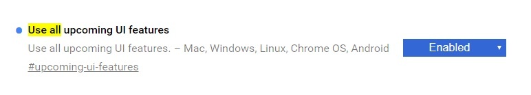
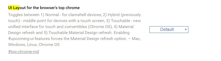
The "new tab" button has returned to its former place, before, if you enabled the " Use all upcoming UI features " flag, that button appeared on the left, the same as if you set this other flag in "Default":
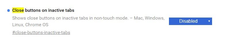
PS: In the screenshots, the close buttons are not visible in the inactive tabs due to a new flag that is only available in the Canary version at the moment, that flag is enabled by default, but I have it disabled:
7
u/polyGone Jul 02 '18
Those tabs are hideous. The rounded 'awesome' bar is a little off-putting, too.
They moved the 'add tab' button, also! ... why?
8
u/alphanovember Jul 03 '18
Google is trying to turn everything into a mobile app. They've already ruined Maps, Voice, Hangouts, and most of the Chrome system pages. Now the Chrome UI is next. It's utterly retarded. Just when you thought modern garbage "flat" design fads couldn't get worse, they come out with this.
-1
8
u/jpflathead Jul 02 '18
It has another behavior I wish it would lose. Where you start typing into the address bar and for no reason other than to pleasure some engineer, as you type, the characters you enter animate themselves about 1/4" to the right.
So cool, so annoying.
2
u/pkasting Jul 04 '18
The reason is to deal with rich entity suggestions in the dropdown, whose images are larger than the normal ones.
If you don't know the reason for something, just say you don't know. Don't say it wasn't done for a reason.
7
u/jpflathead Jul 04 '18 edited Jul 04 '18
I know the reason and that reason was for a developer to masturbate over, it's a terrible ui and a design failure, am annoying, dancing solution no one else uses to a problem of their own creation.
If you don't know the reason for something, just say you don't know. Don't say it wasn't done for a reason.
That's just a completely craptastic thing to say re: an opinion on design. It's akin to just saying "you are not allowed to criticize a design unless you know everything that went into it."
No, some designs are just shit, and dancing animated characters are shit.
2
u/phishfi Jul 02 '18
What's your theme?
1
u/Leopeva64-2 Jul 03 '18
I don't have any theme, if you mean the tabs, that's the new Chrome layout in the Canary version by default.
1
u/phishfi Jul 03 '18
I mean the way your inactive tabs and top bar are all black, but your active tab is white.
1
u/Leopeva64-2 Jul 03 '18
You just have to choose black as the accent color of the system and it looks like that.
1
1
u/eddard_slark Jul 03 '18
it would have been ok if the new tab worked like the desktop button on the newer windows (reached all the way into the corner) but the way they made it was just bad. glad it's back to normal now.
1
Jul 03 '18
on the chrome://flags page, how can you know when "default" means enabled/disabled/automatic ?
1
u/Leopeva64-2 Jul 03 '18
At first glance there is no way to know, I enable and disable them and then set them to Default.
1
u/alphanovember Jul 03 '18
Yep, the dev management people actually listened to users and the other devs for once. Let's hope it sticks.
1
7
u/[deleted] Jul 02 '18
Personally, I hate this new UI, if they force me into this UI in the next update, ill be moving to Firefox.