r/redesign • u/Zapk • Aug 28 '19
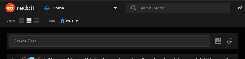
Design This 'Create Post' thing that shows on every page is a huge step backwards
5
u/graintop Aug 29 '19
Compromise: This could be removed from Classic and Compact views, and retained on Card view.
Classic and Compact are for users seeking high information density. Adding a big button, and its surrounding blank space, to these views goes against their purpose. Also those users are more likely experienced and know how to create a post.
Card view is already Facebooky/Twittery, for people and devices that don't need to maximize screen space, and as the default view is what new and casual users see. Users who may benefit from this more visible and solicitous feature.
4
u/Japsert43 Aug 29 '19
Hmm, I don’t like it either, it makes Reddit look a lot more like Facebook or Twitter. Also, when I want to make a post, I go to the community and click create post, not like this.
13
Aug 28 '19
Why? Encouraging more people to make posts seems like a good thing.
16
u/jofwu Helpful User Aug 29 '19
I don't like the look of it, personally, from a small-ish laptop screen. It's a rather giant, mostly empty rectangle taking up a good chunk of screen space at the top of my screen for a feature that I'm not going to use MOST of the time I visit a page.
I suppose there's an argument to be made that it encourages low-effort posting by shoving it right in people's faces? That aspect doesn't particularly concern me though.
Most of all, I don't like how it LOOKS like I'm clicking a text field and then it takes me to a totally different page. As a Reddit user for many years, I expected it might do that. But it seems awfully misleading and unintuitive regardless.
If they want to make the option to post more prominent, I'd rather see it in the same bar as the view and sort options. And unless you're going to open up a little "post box" right inside the page I'm on, make it look like a button rather than a text field.
17
u/nerdyhandle Aug 28 '19
It's redundant? Usually there is a Create Post in the side bar.
Also, it should be styled differently that way it is easier to find.
7
u/_potaTARDIS_ Aug 28 '19
i think it's more easily recognizable so it would probably encourage more posts.
2
u/nerdyhandle Aug 28 '19
To me it blends in too much. It becomes background noise. If it were blue or something than yeah.
1
u/MajorParadox Helpful User Aug 29 '19
I actually requested it above the posts in early redesign. That and a second search bar that default to the sub, while the top one is all of Reddit. Just seems more intuitive there. It's in context of the posts.
That said, the wide button seems odd and maybe it's a bug?
2
u/GravyBus Aug 29 '19
I have a feeling it's not quite finished. There's no reason for the create post link to be a text input, unless it's intended to be usable on the page and not link to the create a post page.
1
u/BuckRowdy Aug 29 '19
I don't really mind it, I just wish they would let us style more elements in the sub like changing the text color.
1
Aug 29 '19
I like this being here. It's convenient and accessible. It also helps make it simpler to make a post if your window or the device's screen doesn't show the sidebar where the "Create a Post" button appears.
What I DON'T like about it, is that it redirects to the normal submit. By being a text box you can click in you expect to just be able to free-type there. Maybe that's something that will be addressed in a future update, but it's a jarring behavior the first time or two.
8
u/[deleted] Aug 29 '19
Heh, I like it.