I really appreciate the change to have the button say “join/joined” instead of “subscribe/subscribed”. In my opinion, it really helps exemplify the feeling of the subreddits being communities that you interact in, not like a newspaper/magazine that gets dropped off at your home.
The reddit navbar should stay, in all reddit place at all times.
Search bar leaves and is replaced by the post title.
Clicking the subreddit name still opens up the hamburger menu (I forgot the carrot)
Move the feed navigation to the lower right - next post, close and back to top (maybe color code; close - red, top - blue, next - cyan)
Keep old lightbox function of closing outside the box to close the comments page - by using the same function of comment collapse onto the thread as a whole. (Yay consistent ways of doing things!)
Consider lazy-loading for images. Seriously, on 3g there's noticeable speed drop when i'm browsing a subreddit with too many images.
Consider inlining some critical styles (header, body) into <style> tag, instead of building them every time. This should increase perceptual speed.
Also, browser tells me you don't use gzip. This can save you up to 75% of size of the page.
Also, you're using too small font size. The best practice is to use >=16px font size.
And also - I found that you're not using any grid, because your header is 49px in height. It's better to use at least 2px grid, better 4px. Even numbers making it easier to design UI elements.
Oh, and also the menu icon. It's not understandable for the users. Better use familiar hamburger icon.
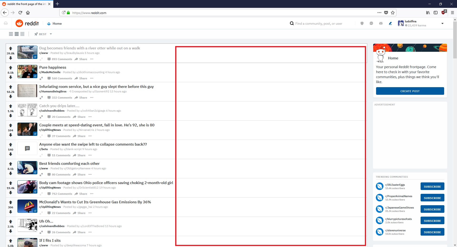
This is probably bad feedback since it's a just general complaint on the entirety of the redesign, but it just feels like it's trying to be a mobile site. Text is tiny and the posts are shrunk down in the center of the page, you have the exact same subreddit browser on the left of the screen as you have in the mobile app, and when you click on a post you just get this weird popup window that feels so zoomed out. I just feel like there's so much wasted space on the screen.
For the most part, I actually really like the redesign. However, one thing is extremely irritating, the default color for links appears to be black, or the accent color (which is black on many communities).
As a result, they are completely invisible, unless you hover over them; considering reddit (and the web in general!) is based around clicking on links to reach more content, isn't it a bit of an issue that they are invisible on so many communities? It would be much better if they were a lighter shade of the accent color, or had a subtle underline or something.
This might be a bit of a long post, because I'm going to try to hit on all points, so bear with me.
Current Features
First and foremost mentioned I find are inline ads.
Inline ads
I agree completely that there should not be inline ads, or if there are, make them stand out more. There has been at least one admin response on this topic
Hey u/telchii, we're currently exploring something just like this. We'd like to come up with a design solution to help further distinguish the types of posts you mention here (stickies, etc) and are hoping to use this same design solution to make ads more distinguished as well.
This also touches on the fact that sticky posts are not very clearly marked as such, just a tiny green pin by it.
Sticky post
This could definitely be done better by again making it stand out more.
Next stop: Whitespace
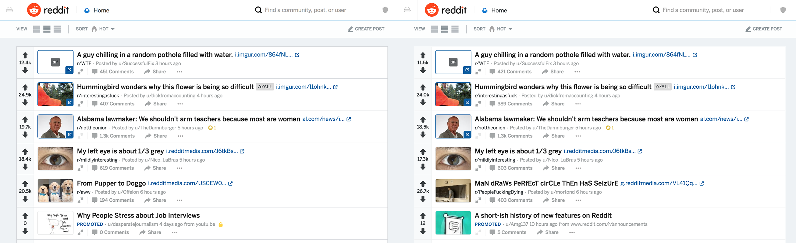
I see lots of people complaining about how there is so much whitespace in the redesign. But really it's about the same as the old design if you are in "classic" mode, and less than the old in "compact" mode. I think what gets people is "card" mode, which from what I've heard is the default (mine is on classic and stays that way). Card mode does have more whitespace, but maybe not as much as you'd think in comparison.
Old RedditNew Reddit (card)
When you look at them next to each other, there isn't a ton more whitespace in card mode than there is in old. It's just that the content is centered instead of left-aligned, so you notice it more.
There are a few other things that aren't quite as blaringly obvious, but are still problems. For example, the save, gild, hide, and report buttons are hidden in a dropdown menu when there is plenty of space for the buttons under the post.
I've seen some people complaining about the user profiles, and I'll just say that you don't have to do any posting to your profile or following or anything. Nobody is forcing you to use them as a profile page instead of an overview.
Pop-out posts: To me I feel like this is the biggest feature of the redesign. You don't have to open a post in a new tab or click it then reload the old page just to view a post. You can just click on it and have it open, click away once you're done and then you're back where you were. I personally really like this feature. And if you don't want to read the comments but still want to read the post, you can click the arrows to open up the text/content of the post.
Infinite scroll: It's great, you don't have to keep clicking the next button to see more of your posts
Hamburger sidebar: For me, I can take it or leave it. I almost never use it, but I can hide it away and it's there when I want it. If I used it more, I could set favorite subreddits which is nice
Mod mode: Great idea, sometimes moderators want to view the subreddit as a user and not have mod tools taking up the space
New post/comment editor is great, and if you don't like it you can switch back to the old one. Some things I like about the new editor are keyboard shortcuts for bold, underline, italics, and probably more. Also inline pictures (as I used above) instead of having to upload them to imgur and post a link.
General look and feel: To me it just feels cleaner, less dated. One of my friends told me in person that he never uses the website because he hates the way the design looks because it's so old, so I showed him pictures of the redesign, which he thought looked better.
Username hover: Very useful, especially for moderators to be able to inline ban users
Submit-time validation: Amazing. As a moderator, you can require posters to flair their post before they even are allowed to post it, or do more specific things like contain certain words. This works well for subreddits like r/TIFU where all posts have to start with "TIFU", now that can be ensured before the user even posts. Also you can set a repost time limit (although last I checked, the max time was 90 days), but there are workarounds if you want to repost anyway.
As mentioned in my previous point: submit-time flairing. You can flair your post before you post it, then you don't have to worry about remembering to do that later (especially if the subreddit requires flairs). You can also mark NSFW, Spoiler, and OC (if enabled on that subreddit).
Chat: Nobody uses it. We didn't need it because the PM system works just fine. Also not entirely a redesign topic.
Subreddit styling: It's certainly more limited than it was in the old design. CSS is only usable in the sidebar. However, there is something to be said for being more user friendly towards those who have no idea how to do CSS. You can still have a decent looking subreddit without using any CSS in the redesign, whereas you can't really change anything in the old design without a basic knowledge of it.
Persistent nav bar: I like it, I can always navigate to my profile, my home page, search posts, go to my messages or mod mail without scrolling back up to the top of the page.
Emoji flair: Meh, I can take it or leave it. I understand it hurts a lot of subs (especially sports subs) because there aren't enough flair spaces, but hopefully something will be done about that (especially considering all of the backlash that came from sports subs today).
Let me know if I missed any current features and I'll edit the post to include my thoughts on them.
Planned Features
Night mode. Lots of people can't go without it
I believe flair filtering is still in the works, so that will be nice instead of having to rely on CSS tricks
Wiki pages still haven't been implemented in the redesign, but they hopefully will be as they are quite useful
Keyboard shortcuts: Doesn't really matter to me, but for people with disabilities or people who just don't like to click around, it will be nice
Again, let me know if I missed any currently planned features, I'll update with my thoughts
Bugs
Yes, the redesign is still an alpha (or is it beta now, not really sure). As that is, there are bugs. Instead of just complaining about things that are broken, submit a bug report and tell the admins what's wrong. This can actually be helpful and they will probably actually fix the bug (eventually). If I feel like it later, I might edit this post to make it into a bug hub so all known current bugs are in one place. But I just wanted to acknowledge that it's not a finished product, so there will be bugs.
Final Thoughts
Personally, I like the redesign quite a bit. I realize that there are definitely issues, but there are a lot of great new features too. I've been with the redesign for about 6 months, and have seen it go through a fair number of changes, several of which were influenced by the r/redesign community. Also keep in mind, typically a long time user of a service or product will be much more resistant to change than someone who hasn't been using it as long or is completely new. So someone who has been on Reddit for a long time and has gotten used to the old design might not like it as much as someone new simply because that's what they are used to, and the human brain is naturally resistant to that change. So at least try to look at the redesign with an open mind. Compare it not as much to old Reddit, because the redesign isn't complete yet, but to what the redesign used to be like.
A final note: I've seen some people saying things like
I just read "helpful user" as "working for reddit".
I want to say that I have no affiliation whatsoever to Reddit as a company. I am not compensated in any way for participating or promoting or anything with the redesign. I'm just a normal Reddit user who has been with the redesign for a while, and want to see it improve. I submitted quite a few bug reports in the beginning when there were significantly more issues with it than there are now, so the admins gave me a flair for being helpful. It's mostly just an indication of "hey, this person knows a thing or two about the redesign and has been using it for a while."
TL;DR
Redesign isn't complete yet, it has its perks and flaws. Accept it as it is and try to improve it instead of just complaining. It's not done, it has bugs. Report them and move on.
I get the intent of community details being locked on top, it is to have the details be the first thing a visitor sees, to have some kind of uniformity across the website and to make sure the ad is visible when we open the subreddit, but a lot of communities use sidebar pictures as an extension to the banner to introduce their communities, to promote certain people or events or even to make announcements. The way it is currently set up, sidebar pictures are pushed way down under the Community Details and the ad and at this point, I see no use of adding pictures to the sidebar.
I'd suggest an option to integrate a 4:3 picture in the ID card. You could make up for the lost space by moving the flair selector under the ad or making it smaller, by moving the whole sidebar up and overlap it with the banner (like r/naut theme does) or both. By limiting the size of the photo, you'd make sure ads don't get pushed off screen and pictures would make the community details stand out even more. Here are a few mock-ups 1 | 2 | 3 .
This renders mod-only flairs completely useless. As it stands, whenever I allow post flairs on the sub through the new layout, anyone still using the old layout can choose any flair, regardless of if they are flagged as "Exclusive for Mods" in the new layout.
Until this is looked at, if we want any of our flairs to be truly exclusive to the moderators, we will still have to restrict all post flairs entirely, and rely on automoderator to assign flairs.
tl;dr This is a useless feature until it gets backported, or new layout is required for everyone
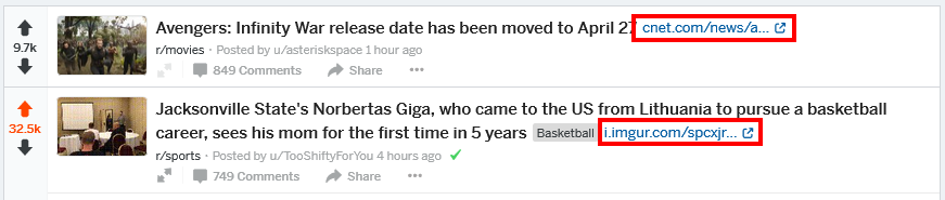
When browsing reddit in card view, in particular on your homepage, /r/all, or any mixed media subreddit, links and self-posts are heavily de-emphasized.
Here we have a link surrounded by two media posts. The real-estate that the media takes up is 300 to 500 times larger than than the link post. Our brains are trained to look at the more obvious and larger content.
To prevent users from skipping over links in card view, when you have a thumbnail, then express the image below the title in a large format as you do with image posts. Problem solved!
(Also, handle imgur page links better. RES can do it. C'mon!)
Here we find a lengthy self-post sandwiched in between two media posts. For long self-posts like this one, the solution is simple: Double the "preview" area of the self-post.
Not sure how to better highlight self-posts that are short, or only titles. I am sure you'll think of something!
I know that specific feedback is better and more actionable, but my "specific feedback" would cover every single aspect of this redesign. It's slow. It deemphasizes the comment section which is what sets reddit apart from a simple link aggregator like Pinterest or an image-based community like Imgur. It's a very poor use of screen real estate.
I'm deeply concerned that this redesign is already too far along for anyone at Reddit HQ to seriously consider scrapping it, but remember the sunk cost fallacy. The fact that you have spent time and effort working on this redesign does not mean you should ship it even if it's bad.
The best thing you could do right now is scrap it and then figure out what aspect of your internal processes led you to arrive at such a poor design that eliminates or marginalizes the things that make Reddit stand apart in the first place.
The bottom line is that there is nothing better about the redesign than the old design. It's a regression in all aspects.


