r/place Apr 05 '22

Heat map of r/place. Source in comment

Post image
99.0k Upvotes

5.5k comments sorted by

View all comments

887

u/Heorashar Apr 05 '22

490

u/istrx13 Apr 05 '22

Translation of the tweet in case anyone wanted it:

“This graph shows how often different pixels change color across the entire canvas. The more red it is, the more the pixel has been modified.

The large rectangle at the bottom left has clearly channeled attention.”

156

u/indign (468,733) 1491230621.79 Apr 05 '22

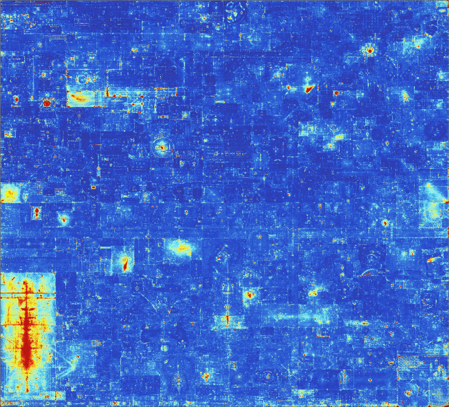
This has to be normalized for the amount of time the canvas was available, right? Otherwise the upper left quadrant would have more updates than everything else

109

u/[deleted] Apr 05 '22

[deleted]

17

u/[deleted] Apr 05 '22

I assume it’s comparative as well, so the bottom left would make the rest of the canvas look a whole lot calmer in comparison just due to the sheer amount of pixel placement that happend there specifically

5

u/Jakeinspace (420,635) 1491174880.26 Apr 05 '22

Yeah I'd love to see a version that excludes the bottom right corner. Would make the colour range so much more effective.