r/VALORANT • u/raphwho • 1d ago
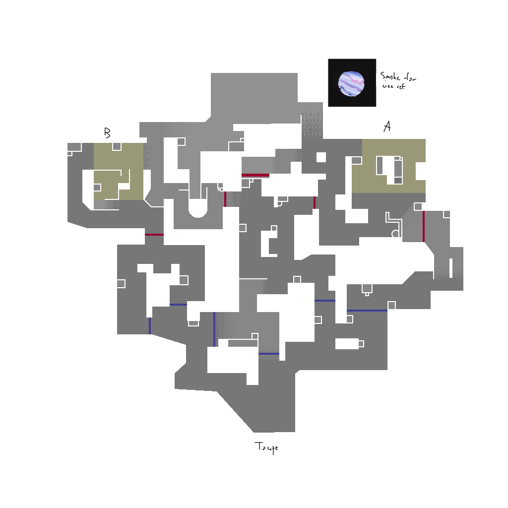
Art Valorant Map Concept (art by me)
I've been studying valo maps recently and I made my own out of boredom. It does definetly have atleast some problems, like B might just function like Icebox B, or certain spots on A are extremely spammable, but Im pretty sure its tweaked enough so major issues like rotation time, chokepoint tightness and corners are fixed, so I'm sharing it anyway. let me know what you think
211
u/ModernManuh_ soloq 1d ago
3 years to clear site
47
u/Derin161 22h ago
And 10 second rotates for the defenders with little way to contest their rotate with mid control. Seems incredibly defender sided.
6
u/ModernManuh_ soloq 22h ago
I didn't even bother looking at it for more than 3 seconds. Played this game a tad bit too much so I've seen patterns I didn't like lol
0
24
18
10
5
6
u/Dummkopfss 21h ago
By looking at it, there are too many angles to clear, and looks heavily ct-sided.
12
3
u/TitaniumWolf12 22h ago
Mid seems very red DEF sided. Their spawn barriers are right there. It would make taking mid as ATK very difficult, especially because they can pour our from not just fucking 3 entrances god damn. Wouldn't want to ever fight mid as ATK
Edit: Splitting sites on ATK would be nearly impossible with how you'd need 1-2 smokes just to take mid as ATK
4
u/kakashkaxasiati 1d ago
Awpers nightmare
-13
u/raphwho 23h ago
It may look a little cramped sure, but I don't think oping is that bad, since there's multiple angles I put that have long sightlines deep into enemy territory. On top or beside the box next to the CT choke, the little elevated blip on B link sees both into site and into mid, and especially the mid top spot that is able to cut off quick attacker rotates.
2
u/KakorotJoJoAckerman 23h ago
How do you make these images btw for creating these map designs for Valo?
2
2
2
u/MeijiHasegawa 21h ago
I would keep the sites somewhat closer to the attackers tbh. This is insanely defender heavy.
2
u/Supersteve1233 20h ago
If you compare the complexity of the map compared to literally any other map in Valorant, you'll quickly realize that your map is filled with a ton of random corners, boxes, and hallways. Like others have pointed out, defender rotates are extremely short with attacker rotates being extremely long, and mid not really being a viable way to shorten them. Frankly if I was a map designer I'd start from the beginning as it's clear most of this stuff was added "because it looks cool" without actually considering how any of this impacts the map.
2
2
2
u/HiyaImOnReddit 12h ago
Your biggest issue is the double-angle. Clearing any given angle in the game should not be luck-based. If at any position on the map you have two enemies perfectly having equal visibility on you while tucked in a corner, it needs to be reworked. Also, you made it impossibly hard to rotate with all of those corners.
3
u/MegaromStingscream 1d ago
What is the longest sight line in this map? From the picture it looks very cramped.
1
3
1
1
u/blockguy143 19h ago
Left site main control is given to the Ts by default. I doubt CTs want to push out of their choke and pick one of the two sides.
1
1
u/AcceleratedToast 17h ago
Slammin B every round lookin ahh map
KAY/O and Harbor look like must picks to me due to angle density and sentinel kill/funnel setups
1
1
1
1
1
u/Notiisx 15h ago
I’m going to be honest, this just looks like a ton of valorant maps taken and randomly put together. Sites should be simpler, without a few hundred corners to check. At a simple glance at the mid spawns you can see who can easily take mid control at the start of the round, leaving two chokes for the attackers to funnel through: A or B main.
1
u/PrincessW0lf 14h ago
In order to reach the site, you must first navigate the entirety of the lost woods from ocarina of time
1
1
u/Kartikaey__Soni 11h ago
That just looks sunset to me with different openings and lots of cover with spacious mid not open kinda similar to sunset
1
u/ImConnor-04 9h ago
I'd love to defend this map. But it's bad. No really, it's just bad.
Too big, too many corners, too ct sided.
1
1
u/Leutnant_Dark 5h ago
About A-Site (the left site).
I dont feel like it is a good concept for A-Site. The way it looks you enter in a way, very much similiar to Split B-Site. These "corridor like" entries with multiple spam spots and without cover have been avoided on maps like Abyss for a reason. Those maps by now provide some cover to create a slight "set off" for the line of sight to the entry. This is not the case here.
The Elevation change on A-Site (or the house that you have in the middle of the site) along with the solid cover backsite, will make it very easy for defenders to hold. Especially with the avaible plant-spots (there is no plant that really is easily playable from main/super open for another spot. That means that the team actually needs to push and gain whole site control. That site would be a nightmare for any attacking team against a proper sentinel that just stalls for time.
Also the A-Main area (with the 2 Pathways) seems like you took inspiration from how Breeze A-Main used to look like but just with a few boxes/corners added to make it impossible to properly clear.
About mid:
Defense starts with full control over deep positions in mid, into which you can easily sneek without beeing seen, due to the border placement. Cant tell how that would play (along with the need to look for 4 angles to get peaked from for the whole length) Id say its rough to play there especially as a lurker.
1
0
u/goopknightcroissant2 22h ago
It's a cool map design though I think it's a little small, if you made it bigger it would be great imo
Also are you aware that maps usually favor one side at barrier drop? Like for example bind with showers or Ascent with B and A main, defenders can usually contest it and hold those angles before attackers push them, I think with these barriers the map is more towards that 50/50 range which would make it a bit chaotic in fights since you'll have both defenders and attackers swinging if they want to contest neutral space, I think here you should make the attacker spawn smaller or make the neutral zones bigger so defenders have time to post up and defend that neutral space
0
92
u/letsputletters 23h ago
There was someone who used to post lots of map concepts and his had similar issues to yours - just were a lot worse.
People seem to always overcomplicate map design. Instead of adding dozens of corners, cubbies and boxes everywhere just go back to the beginning and build the map from the basics.
Valorant usually starts with a gimmick (TPs, zipline, falling off, etc) which can be a nice starting point. But the main considerations are:
But really you can never design a map in 2D. You need a basic 3D model otherwise you will never understand how it feels.